How to use ClickUp to Streamline Brand and Website Design Projects
As a designer, efficient project management and client communication are paramount to success. As the owner of a creative design studio, I have spent years refining and optimizing my client process and last year, I embarked on a massive overhaul to elevate the entire experience for both my team and our valued clients.
The result?
A streamlined, organized, and user-friendly ClickUp list that has revolutionized the way we handle design projects. Not to mention, it has eliminated scope creeps, the amount of phone calls we do with clients and shortened project timelines greatly increasing our profit and overall revenue!
In this blog post, I’ll share the three key features of the Client ClickUp Folder and explain how it has helped improve client retention, increase profitability, minimize scope creep, and elevate the overall client experience.
I also go through this in-depth on Behind the Design Podcast in Episode 101: Elevate Your Processes & Increase Profitability with ClickUp. In the episode I share the exact reasons why I switched to ClickUp, an inside look of how we use it with clients and our internal processes, and how I’ve been able to ditch all other platforms to streamline to just ONE.
Two Separate Lists: Internal vs. Client-Facing
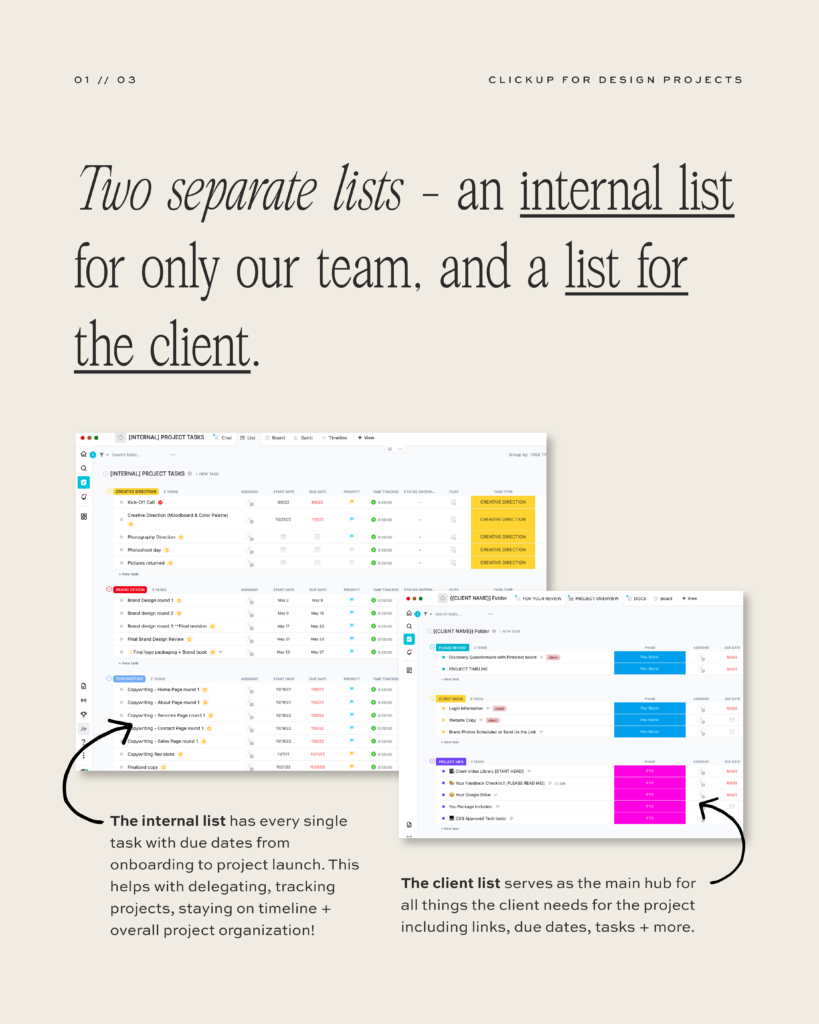
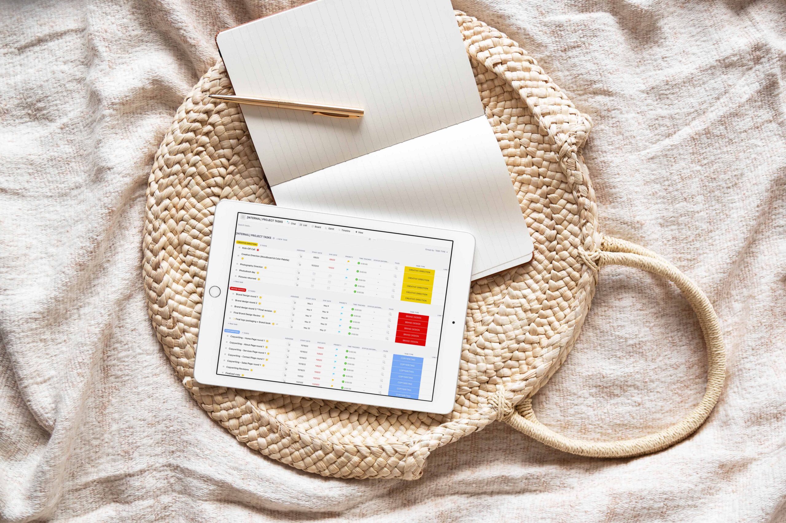
One of the central pillars of our new client process is the division of tasks and information into two separate lists. The first list is exclusively for internal use, accessible only to our team. This list encompasses every single task and deadline from the onboarding phase to the project launch. Having a comprehensive overview of our workflow ensures that nothing slips through the cracks, and deadlines are met without fail.
The second list is designed for the clients and serves as a centralized hub for all project-related elements. Here, clients can access essential links, due dates, tasks, and more. By providing our clients with transparency and easy access to project details, we create a sense of trust and collaboration. They know exactly what to expect and when, fostering a smoother project journey.

Client Review List
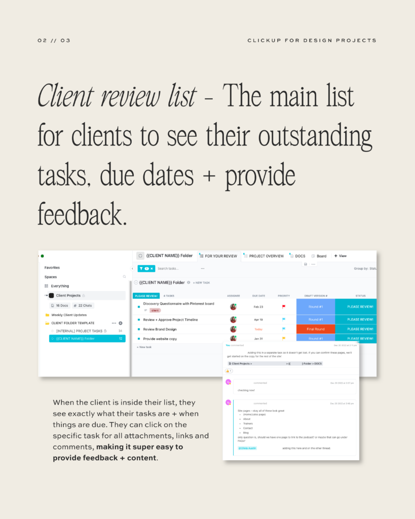
Prior to creating a simple review list, our clients would have access to the entire project checklist. We found this to be a problem because it was overwhelming and they didn’t know what to be working on or what was a priority, which in turn led to them not providing us with copy, photos, etc. Within the client-facing list, we have a dedicated section called the “Client Review List.” This section offers clients a clear view of their outstanding tasks, due dates, and the ability to provide feedback. By offering this level of transparency, clients can stay informed about the project’s progress and never feel out of the loop.
Clicking on specific tasks in the review list grants clients access to all relevant attachments, links, and comments. This simple yet powerful feature makes it incredibly easy for clients to provide feedback and submit content. Efficient communication leads to quicker revisions and a more seamless workflow, ultimately boosting client satisfaction.

Centralized Documents
One of the common challenges in project management is managing multiple documents and preventing essential information from getting lost in the shuffle. For example, we were using google docs, ClickUp docs, dropbox, it was a mess and so hard to find anything! To combat this issue, we’ve introduced an ingenious solution within ClickUp.
Under the “DOCS” tab in the client-facing list, we store all pertinent documents related to the project. These pre-existing documents provide clear instructions on what we need from the client. By consolidating all essential files within the platform, we eliminate the need for external links (like Google Docs), ensuring that everything is readily available and well-organized. This not only saves time but also enhances the overall client experience.
The transformation of our client process through the implementation of a detailed ClickUp Client Folder has been a game-changer for my business. By streamlining our projects, we’ve witnessed a substantial increase in client retention, higher profitability, and a significant reduction in scope creep. Our clients now enjoy a more seamless and transparent experience, leading to greater satisfaction and loyalty.
If you are interested in using my exact client process through ClickUp, you can grab the exact template we use HERE.
For even more information, tune in to Episode 101: Elevate Your Processes & Increase Profitability with ClickUp. In the episode I share the exact reasons why I switched to ClickUp, an inside look of how we use it with clients and our internal processes, and how I’ve been able to ditch all other platforms to streamline to just ONE.
ClickUp revolutionized the workflow in my agency, eliminating bottlenecks in client and team communication, allowing us to get efficient client feedback, systemize client expectations, enhance team collaborations and optimize products. It’s truly the reason I can run a multiple six figure design studio working part-time hours.
Learn how this powerful platform transformed the business operations and client interactions, paving the way for efficiency, clarity, and seamless project management and how you can use it too!

6 Figure Designer's Growth Guide
Free Course
6 Figure Design Process
Free Course
ClickUp Clients & Leads Tracker
Free Template
Best place to start!
Free resources
your business & life
to enhance
Free resources to enhance your business & life
Contact
About
Templates
SGA Course
Designed to Scale
Podcast
Resources
The Blog
Speaking
Work with me
Resources
Connect
Terms & Conditions | Brand & Website Design by Current Design Studio